google.com, pub-3359476637221643, DIRECT, f08c47fec0942fa0 Undercover Comics

Total Pageviews

Saturday, July 7, 2018


FANTASTIC FOUR #61 - Pencil! Ink! Action!

I bought this beat up copy for $7.50

It's fun to read these old issues, in no order other than when I buy them, the same way I used to read them when I was a kid and teenager). Storylines are somewhat overrated if you ask me... sometimes I just want 15-20 minutes of entertainment.

And one title that always seemed to deliver was the Fantastic Four.


(FANTASTIC FOUR #61 - cover dated April 1967, on newsstands January 10th, 1967 with cover art by Jack Kirby)


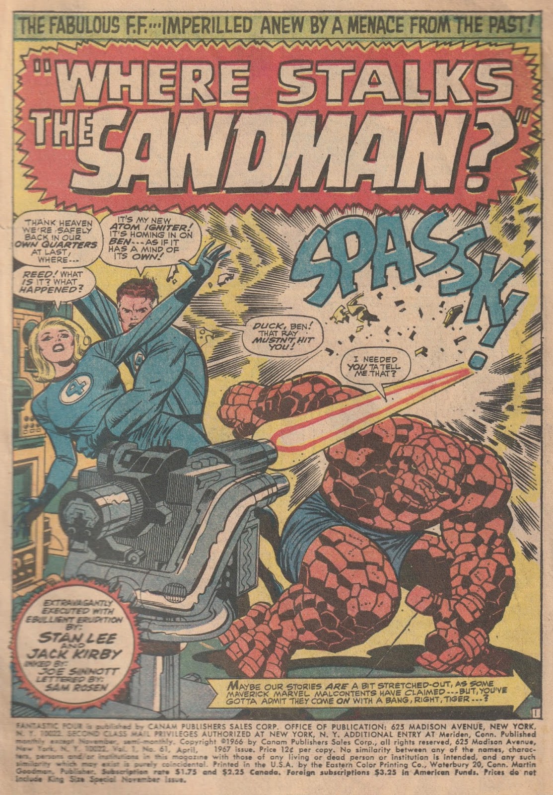
And deliver it does, starting off with a bang as the Baxter Building is under attack! The FF would seemingly alternate between calm and then crazy openings but was always full of action.
(FANTASTIC FOUR #61 - cover dated April 1967, on newsstands January 10th, 1967 with art by Jack Kirby)


If there's one thing Stan Lee did that I was a big fan of, it's dialogue Ben Grimm. And at various times he was hilarious as in this sequence. Whereas the Avengers never could seem to get this right with me (Hawkeye was more of a wise guy than funny), the FF's characters seemed to have the perfect interaction with each other.


(FANTASTIC FOUR #61 - cover dated April 1967, on newsstands January 10th, 1967 with art by Jack Kirby)


He's page 14 of the issue in it's penciled form. You can see Jack's very full pencils and his margin notes. There's a fair amount of these pages out there, so it's cool to see what Stan used and didn't use or changed and added. Here, not too much, it's just cool seeing it through each stage of the process.


(Original art from FANTASTIC FOUR #61 - cover dated April 1967, on newsstands January 10th, 1967 with art by Jack Kirby)


Here's the page with Sinnott's inks, and you can see how much it brings the page to life. He was my favorite Kirby inker, and really... I used to LOVE those Essential collections that had the art in Black & White. I know people swear by newsprint and that shitty color process of comics back in the day but... not me.


(Original art from FANTASTIC FOUR #61 - cover dated April 1967, on newsstands January 10th, 1967 with art by Jack Kirby and inks by Joe Sinnott)


Here's the final finished page.


(FANTASTIC FOUR #61 - cover dated April 1967, on newsstands January 10th, 1967 with art by Jack Kirby)


Kirby's action storytelling style was so enjoyable on these...


(FANTASTIC FOUR #61 - cover dated April 1967, on newsstands January 10th, 1967 with art by Jack Kirby)


What the heck, let's look at the original art on this page as well...


(Original art from FANTASTIC FOUR #61 - cover dated April 1967, on newsstands January 10th, 1967 with art by Jack Kirby with inks by Joe Sinnott)


Monday, July 2, 2018


SUPERBOY and the LEGION of SUPER-HEROES #197 - Pencil! Ink! Action!

I bought this beat up copy for $4.00

Nothing against Cary Bates, who... wrote some decent stuff for DC Comics in his long career there (sold a few stories at the age of 13, wrote regular beginning in 1970 at age 17, and stayed until 1986). But this is all about the creativity of Dave Cockrum.

Superboy and the Legion of Super-Heroes was monthly, except for March, May, August and December. Not sure if those were holiday months for various staff or what. This one starts off with a great Nick Cardy cover. Right away we see that Timber Wolf has a new costume!

#195 had really ramped up the new look LSH and this issue was following in that trend. It was the first issue it shared title billing on the cover!


(SUPERBOY and the LEGION of SUPER-HEROES #197 - cover dated September 1973, on newsstands June 19th, 1973 with cover art by Nick Cardy)


The Legion story leads off this issue, and if I had been a little older and a more regular reader, it might have made me wonder (in a good way) what the heck was going on here. Legend is that the response to Cockrum's look for the LSH (and I suppose Cary's stories) was overwhelmingly positive and so DC started featuring them more and more.

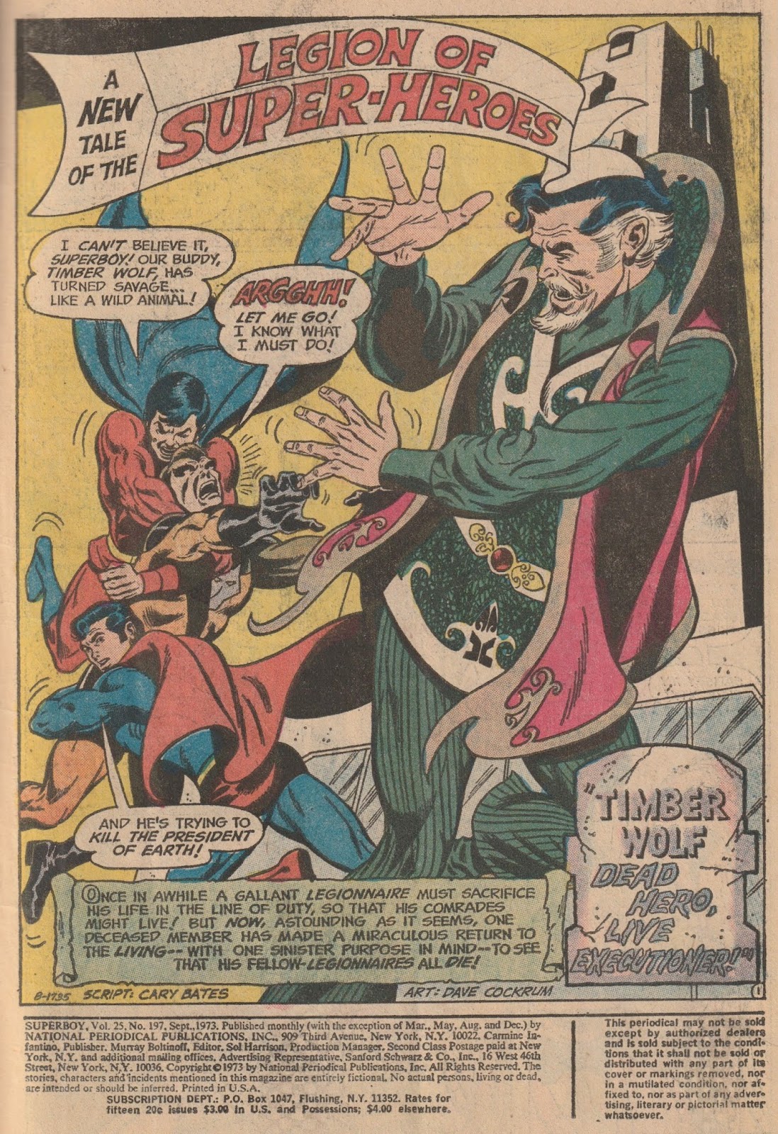
This is a great splash page, probably more fitting in a Marvel Comic, but that was what Dave brought to DC, in his short time there... he also inks his own work here on this story.


(SUPERBOY and the LEGION of SUPER-HEROES #197 - cover dated September 1973, on newsstands June 19th, 1973 with art by Dave Cockrum)


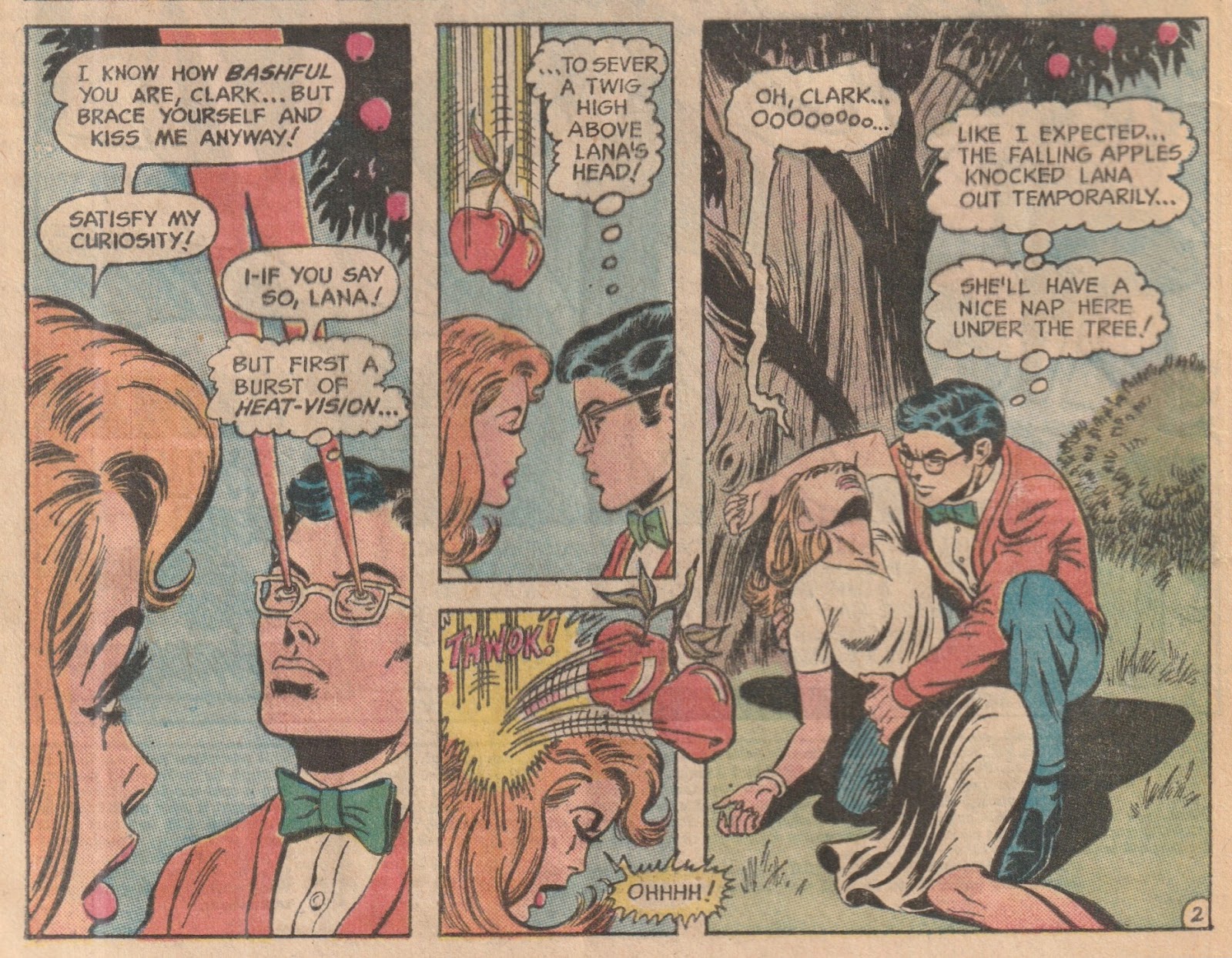
Here's a situation that probably wouldn't be well received today. Clark Kent gets a signal from the future that the LSH needs him, so he decides to use his heat vision to drop and apple from the tree and KNOCK HER OUT COLD.

That's pretty harsh Clark. No one complains about THIS though. As Superman (in the movie) he kills a homicidal maniac who plans on destroying the earth at all cost - everyone loses their mind - give your girlfriend a concussion so you can sneak off to the future - perfectly acceptable!


(SUPERBOY and the LEGION of SUPER-HEROES #197 - cover dated September 1973, on newsstands June 19th, 1973 with art by Dave Cockrum)


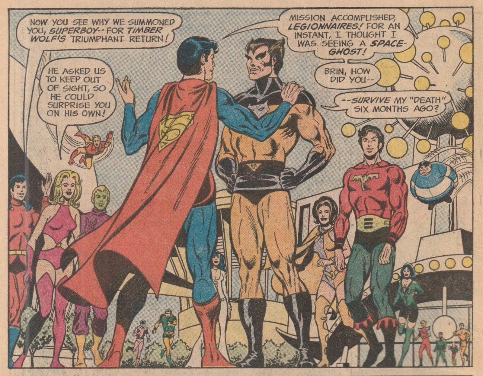
Timber Wolf's new costume is pretty cool and whereas you can see they may have used the Wolverine concept as a bit of a jumping off point, slightly changing the color, Marvel would pay back the homage by giving Wolvie a costume similar to this a few years later.


(SUPERBOY and the LEGION of SUPER-HEROES #197 - cover dated September 1973, on newsstands June 19th, 1973 with art by Dave Cockrum)


Cockrum was a Star Trek fan and he brought that futuristic aesthetic to the LSH!


(SUPERBOY and the LEGION of SUPER-HEROES #197 - cover dated September 1973, on newsstands June 19th, 1973 with art by Dave Cockrum)


Probably influenced by Gil Kane, but man, did I like this a whole lot better. Cockrum should've been an early superstar in the business.

In this issue, Lightning Lad also gets a costume change and I think it's one of the best costumes ever designed for one of the team! He's been a team captain and leader (and one of the charter members since the beginning), so it's only fitting he has a sort of military, officer kind of look.


(SUPERBOY and the LEGION of SUPER-HEROES #197 - cover dated September 1973, on newsstands June 19th, 1973 with art by Dave Cockrum)


For some reason, the first appearance of Saturn Girl's more... revealing costume isn't something fans necessarily look for, so in case you're wondering - this issue ISN'T it. It actually changed back in Action Comics #392 from July of 1970 (3 years earlier). The costume design was actually sent in by a fan (K. Haven Metzger).


(SUPERBOY and the LEGION of SUPER-HEROES #197 - cover dated September 1973, on newsstands June 19th, 1973 with art by Dave Cockrum)


CAPTAIN AMERICA #113 - It's all about the Art!

I bought this beat up copy for $7.50

I may have my issues with Steranko the 'person', but he certainly created some of the most memorable handful of issues ever made in comics. Probably no artist in history has less work that is more popular than Jim Steranko.

Captain America #113 was the third of 3 issues he did in 1969 - the first two #110 and #111 interrupted by the origin retelling in #112 that Jack Kirby reportedly had to do in a weekend because Steranko was late.

That's of course what you get from people who are more geared toward design and interesting artistic expressions.... they tend to be a lot LESS geared towards deadlines and structure.

NOTE: According to the ever eager to promote himself Steranko, he penciled, inked, colored and lettered the cover and on the inside, plotted the story (dialogued by Stan Lee), penciled it, had Tom Palmer ink it (other than the 2 page spread that HE inked and lettered), while Artie Simek lettered all but the center spread.


(CAPTAIN AMERICA #113 - cover dated May 1969, on newsstands February 4th, 1969 with cover art by Jim Steranko)


In the issue, we see from the opening splash page, the type of work that would inspire artists for the next couple of decades. Steranko was inspired by a creative genius' from HIS younger days, the amazing Will Eisner, who had a real flair for opening pages in his Spirit stories.

Combined with his obvious love for movies, this opening splash makes perfect sense. 20 years later Frank Miller would beat this idea to death in DKR.


(CAPTAIN AMERICA #113 - cover dated May 1969, on newsstands February 4th, 1969 with art by Jim Steranko)


Speaking of influencing Frank Miller, why doesn't anyone ever mention Steranko's influence on his Sin City? Isn't it obvious?

This is a great sequence from an art perspective, but from an editorial point, it... sure does take up a lot of room to put forth a simple idea. That's why I'm NOT a big fan of editors - it's COMIC books, not BOOKS... it should ALWAYS be about the art and the design and the ability to tell the story with the ART. This does it amazingly.


(CAPTAIN AMERICA #113 - cover dated May 1969, on newsstands February 4th, 1969 with art by Jim Steranko)


Same thing here... what's with all the wasted space?

Well... it LOOKS cool. That's what it's supposed to do. Really, when it comes right down to it... there are really only a handful of comic book STORIES that are worth saying are really GREAT. Most of of them just follow the basic guideline of - Bad Guy shows up, looks like he'll win, Hero beats him.

So make it LOOK good.


(CAPTAIN AMERICA #113 - cover dated May 1969, on newsstands February 4th, 1969 with art by Jim Steranko)


Now THAT is a two page spread. Steranko was great at these...

Really, did we criticize the Image Comics guys for the wrong reasons? Wasn't all of that art supposed to LOOK cool. Did it really matter that the STORIES were... regurgitated drivel? What are Marvel and DC's stories? Regurgitated drivel.

Make it LOOK good.


(CAPTAIN AMERICA #113 - cover dated May 1969, on newsstands February 4th, 1969 with art by Jim Steranko)