google.com, pub-3359476637221643, DIRECT, f08c47fec0942fa0 Undercover Comics

Total Pageviews

Saturday, September 1, 2018

DEADLY HANDS OF KUNG FU #16 - What'd you call me?

(DEADLY HANDS of KUNG-FU #16 - Cover Dated Sept 1975 - on Newsstands August 7th, 1975 - cover art by Luiz Dominguez)

Deadly Hands of Kung Fu #16 starts off with a painted cover by Luiz Dominguez. Not my favorite DHoKF cover, and certainly not my favorite Luiz Dominguez painted cover (that would be Dracula Lives #5), but... it conveys a scene from an interior story pretty well so... it's all good.

I love this beat up copy I can read and look over endlessly. Ah, the beatup comic. So awesome.
Originally released one day after my 12th Birthday in 1975.


(DEADLY HANDS of KUNG-FU #16 - Cover Dated Sept 1975 - on Newsstands August 7th, 1975 - art by Frank McLaughlin)


Not sure where Frank McLaughlin got this story from or who the Thai King is supposed to be, but it's a very cool one page tale that he wrote and drew. McLaughlin of course is a Judo teacher and the creator of the JudoMaster character from Charlton Comics (now owned by DC). And he was a regular contributor to DHoFK.
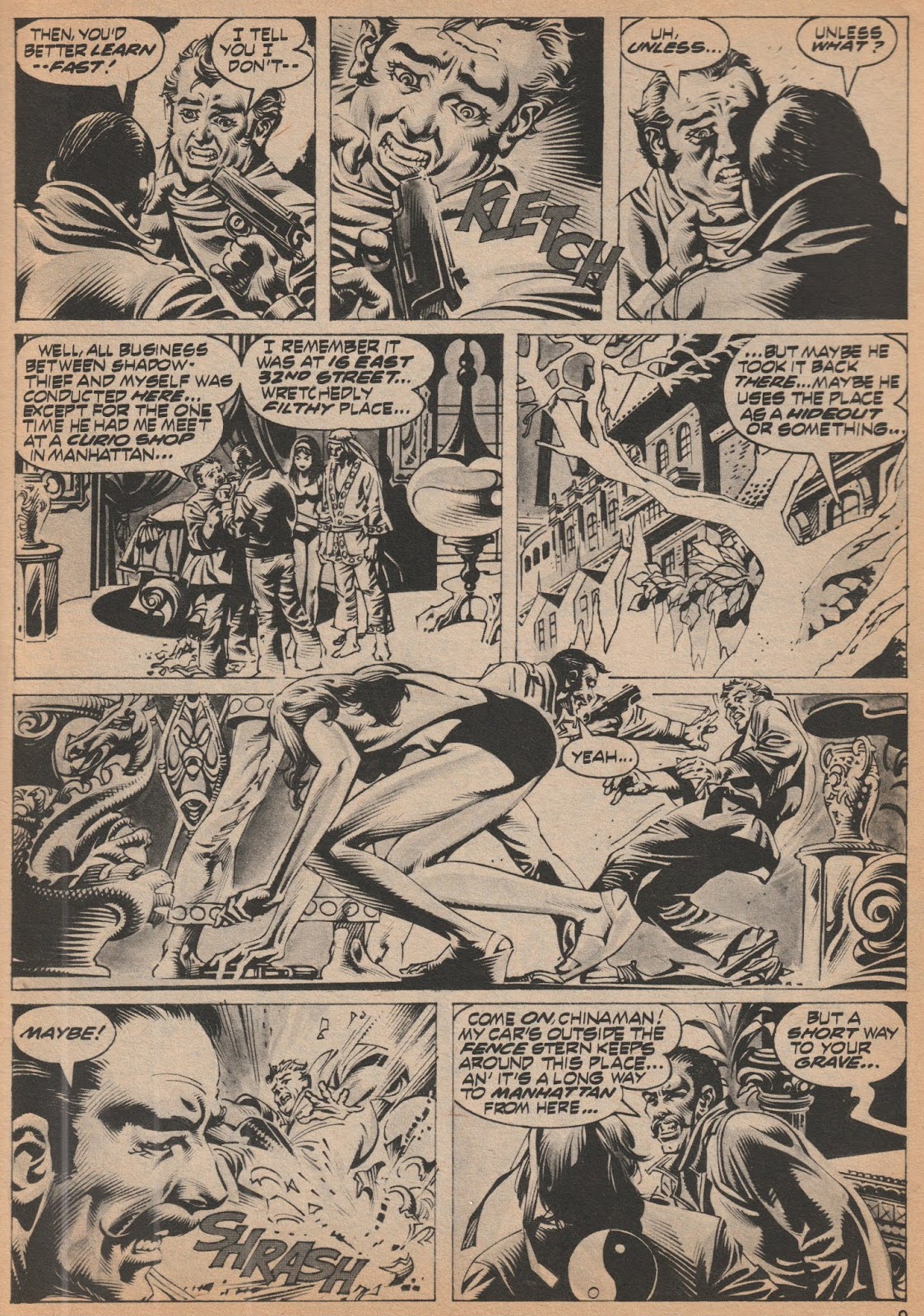

(DEADLY HANDS of KUNG-FU #16 - Cover Dated Sept 1975 - on Newsstands August 7th, 1975 - art by Rudy Nebres)


Rudy Nebres was one of my favorite artists of the wave of Filipino talent that came over in the 70's and started working in the comic book business. His dark brushed style was perfect for the Black & White Curtis Magazine stories. He was a regular in DHoKF from 1975-77.

"Demons in Painted Death' is Part 4 in the 'Golden Dragon' Serial, written by Doug Moench. It would run 6 parts total, all drawn by Nebres, in DHoKF issues #12-14, and 16-18.
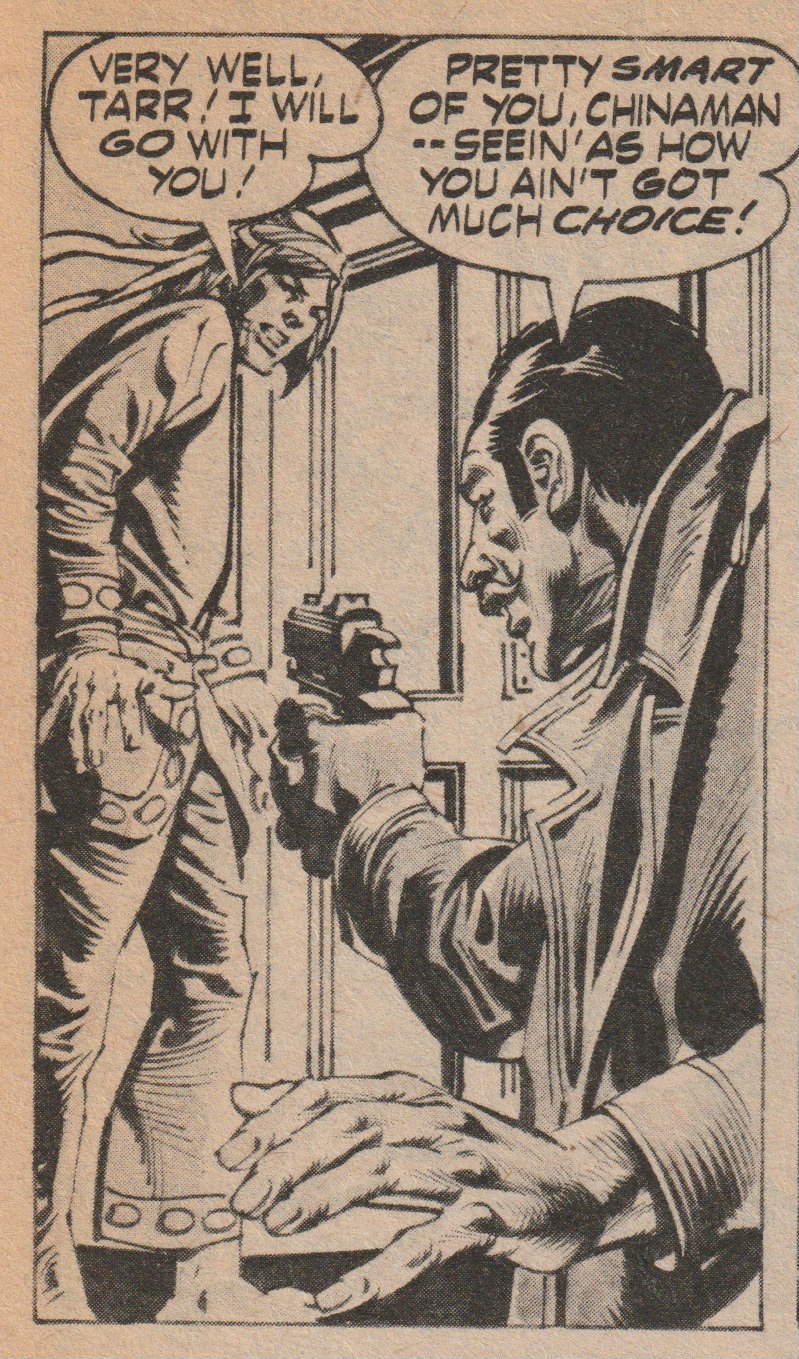

(DEADLY HANDS of KUNG-FU #16 - Cover Dated Sept 1975 - on Newsstands August 7th, 1975 - art by Rudy Nebres)

One thing that really stands out to me about some of these stories is the blatant racism of the bad guys. Shang-Chi gets called 'Chinaman' by this guy so many times, that by the end of the story, I'm READY for Shang-Chi to knock his head off!


(DEADLY HANDS of KUNG-FU #16 - Cover Dated Sept 1975 - on Newsstands August 7th, 1975 - art by Rudy Nebres)

And boy, could Nebres draw Shang-Chi knockin' people's heads off! I used to slowly take in every panel of a page like this...


(DEADLY HANDS of KUNG-FU #16 - Cover Dated Sept 1975 - on Newsstands August 7th, 1975)

One big difference between Marvel and DC back in the day, was Marvel's sense of humor. You just wouldn't see a goofy ad like this in a DC Comic. Marvel wasn't afraid to have a little fun when trying to talk you out of your money.


(DEADLY HANDS of KUNG-FU #16 - Cover Dated Sept 1975 - on Newsstands August 7th, 1975 - art by Sanho Kim)

The middle story of the book is 10 page John Warner story called 'The Corpse Rider'. Drawn by Sanho Kim (also a regular contributor to DHoKF), his style is almost the opposite of Nebres, and yet it works perfectly for this story.

In Ancient Japan (the city of Kyoto is mentioned), a man who'd left his wife to try and become a great Samurai, finds out she died of a broken heart. To keep her from rising from the dead and claiming her vengeance, he has to get on her back and hang on throughout the entire night as she DOES rise from the dead and go on a killing spree!

It's a cool story and the art is just right in its creepiness and haunting mood... 


(DEADLY HANDS of KUNG-FU #16 - Cover Dated Sept 1975 - on Newsstands August 7th, 1975 - art by George Perez)


The cover story is a Sons of the Tiger 1st parter called 'The Rites of Every Citizen', in which the team goes to investigate killings at a prison and get caught up in a really bad scene. Again, the bad guys have a sick, racist edge to their abuse, the main guard continually calling Abe (he's black), the highly offensive 'boy', numerous times. 

Personally, it's over the top, and I'm curious if they kept it as is in the collected editions.


(DEADLY HANDS of KUNG-FU #16 - Cover Dated Sept 1975 - on Newsstands August 7th, 1975 - art by George Perez)

Anyway, in case you're unaware, the Sons of the Tiger are the leader, Lin Sun (Chinese), Abe Brown (African American) and Bob Diamond (Caucasian), plus Lotus (the Asian babe) who is now a 'Daughter of the Tiger'. 

Not sure why they broke the team up a couple of issues later, but some of them have made appearances over the years.

A very entertaining issue!

Monday, August 27, 2018

FANTASTIC FOUR #142 - Everything but the Kitchen Sink!

One of the earlier comics I owned within the actual time frame it came out, I would’ve been 10 years old when SOMEONE made this available to me. The cover really stood out...


(FANTASTIC FOUR #142 - Cover Dated January 1974 - on Newsstands October 16th, 1973 - cover art signed by Buckler and Sinnott)

This period of the Fantastic Four is either extremely underrated or extremely overrated, depending how you look at it - but for me, yeah, a lot of it is simply themes that are repeated throughout the history of the book (The Thing gets frustrated and quits, Dr. Doom revealing himself as the bad guy, etc.), BUT it has one redeeming aspect to it all. 

Rich Buckler. 

Rich Buckler achieved a dream of his by getting to take over this book and really, with inks by Joe Sinnott, this is (to me) some of the best work he ever did. (I personally thought Sinnott’s inks worked better for Buckler than Kirby - I like Chic Stone inking Kirby the best). 


(FANTASTIC FOUR #142 - Cover Dated January 1974 - on Newsstands October 16th, 1973 - art by Rich Buckler with inks by Joe Sinnott)

To me, this is the period that MADE the Bronze Age. These were highly stylized artists that either reached their peak during this time (Dave Cockrum on Superboy and the LSH, Jim Starlin on Captain Marvel, Rich Buckler on FF) or would begin to in the next year or two (George Perez on Avengers, John Byrne on X-Men). Note: And of course, I believe Ross Andru did his best work on ASM with his double inking team of Frank Giacoia/Dave Hunt - but I know it’s not everyone else’s fave. 

On top of that you still had Bernie Wrightson just finishing a breathtaking run on Swamp Thing (and Mike Ploog on Marvel Spotlight with Ghost Rider), Barry Windsor-Smith after a run on Conan, going beyond the quality of expectation on the Black and White mags, along with a wave of new great talent like Pablo Marcos, Rudy Nebres and even long-time talent coming into their own like the underrated Jim Aparo. 


(FANTASTIC FOUR #142 - Cover Dated January 1974 - on Newsstands October 16th, 1973 - art by Rich Buckler with inks by Joe Sinnott)


Talk about understanding the Kirby way of doing Marvel Superhero art... here Buckler makes Reed Richards dynamic in every pose - even though his emotion is one of grief - and yet he still is able to convey it and even cover his face (shame). Great stuff from what you’d expect in the World’s Greatest Comic Magazine!


(FANTASTIC FOUR #142 - Cover Dated January 1974 - on Newsstands October 16th, 1973 - art by Rich Buckler with inks by Joe Sinnott)

The Thing at one time was one of the stars of the Marvel Universe, appearing monthly in the FF, the FF reprints in Marvel's Greatest Comics, and with a guest star each month in Marvel Two-In-One. Then afterward in his own monthly series! One of the great, unique characters of the Marvel Universe!

Here Buckler lays out a perfect blend of action and dialogue, changing camera angles perfectly to tell the story. Man, I can see why I was so impressed with this as kid, without even knowing why! (Notice the written ad blurb for Crazy Magazine at the bottom left corner - remember these?) 
Yep, the perfect blend of action and dialogue.

Speaking of dialogue, Gerry Conway (only 22 years old when he wrote this - having been at Marvel already for 4 years!), had a busy month for comics released with a January 1974 cover date. The 20 page Incredible Hulk #171 that would also end up a Record and Comic Set, the 19 page Amazing Spider-man #128 Vulture story, the 11 page Dracula Lives #4 story,  the 19 page Sgt. Fury #117 story,  the 19 page Thor #219 story, a 5 page story for DC's Witching Hour #38, PLUS this 19 page yarn.
That's 112 written pages of story and dialogue - he probably had a bad case of writer's cramp!


(FANTASTIC FOUR #142 - Cover Dated January 1974 - on Newsstands October 16th, 1973 - advertising cover art by Gil Kane)


As a kid, I wasn’t the biggest Gil Kane fan. His angular, jagged edges in very harsh contrast to Romita’s smooth style (I know, I know, but Ross Andru, right?).
Here though, inked heavily by Frank Giacoia, I dug this almost 3-D looking cover in this ad, even back then. 

Frank Giacoia was maybe one of the underrated inkers in the business, working from the Golden Age into the early 80's. 


(FANTASTIC FOUR #142 - Cover Dated January 1974 - on Newsstands October 16th, 1973 - art by Rich Buckler with inks by Joe Sinnott)

And of course the big reveal at the end. It became more and more of a tough way to handle a Dr. Doom story as time went on... so everything went into the build-up. Great villain, but... what to do with him...

Superman's Girlfriend LOIS LANE #35 - Scheming Up and Teaming Up!

Man, it’s amazing to me what comics I can find, beat up, in $1 bins! Another classic Superman/DC artist that I prefer to Curt Swan, the oft-forgotten Kurt Schaffenberger, here with an early 60’s ‘modern-ish’ theme. I really like the way he uses shadows and shading to show depth and perception.


(Superman's Girl-Friend LOIS LANE #35 - Cover Dated August 1962 - on Newsstands June 26th, 1962 - cover art by Kurt Schaffenberger)

Schaffenberger doesn’t get the recognition of a Curt Swan, but just looking at an opening splash page like this and you can see he had a clear vision and a sure line. You can tell what's going on just by their body language. THIS is how you convey information through art!


(Superman's Girl-Friend LOIS LANE #35 - Cover Dated August 1962 - on Newsstands June 26th, 1962 - art by Kurt Schaffenberger)


Women in Romance Comics (and let us make no mistake, Lois Lane was a Romance Comic first and foremost) are always scheming and competing. Lois doesn’t realize it, but that behavior to get ahead with a story is going to follow into her love life as well!


(Superman's Girl-Friend LOIS LANE #35 - Cover Dated August 1962 - on Newsstands June 26th, 1962 - art by Kurt Schaffenberger)


 Scheming, competing and sometimes outright nuts! Lois will destroy the computer of the future (someone else’s property) to keep her rival from winning Superman!
Aw, that’s sweet! Psychotic, but sweet!

I love this very simple and yet informative panel. Even with minimal space, he gives the characters body language and facial expressions that are telling. 


(Superman's Girl-Friend LOIS LANE #35 - Cover Dated August 1962 - on Newsstands June 26th, 1962 - art by Kurt Schaffenberger)

I want both of these! Remember a time when it didn’t seem like a rip off that they were putting out an EXTRA comic for your favorite title, called an Annual?


(Superman's Girl-Friend LOIS LANE #35 - Cover Dated August 1962 - on Newsstands June 26th, 1962 - art by Kurt Schaffenberger, various on the Batman Annual)


I can’t help but make these comparisons right here in the same comic - Swan’s work looks very bland to me compared to Schaffenberger. Both these characters appear stiff and unemotional as they look at a photo of Superman saving Lois. 

Leo Dorfman's story (previous) with Schaffenberger is fun, even if Lois goes a little goofy with jealous and over competitiveness. It's difficult to balance that in DC's line of books - keep it light - with a bit of 'oh no, what will happen next' - without drifting too far either way - serious drama or absurd kiddie stories.


(Superman's Girl-Friend LOIS LANE #35 - Cover Dated August 1962 - on Newsstands June 26th, 1962 - art by Curt Swan)


Jerry Siegel’s story here is a bit hokey - Lois loses her memory, Superman reveals his secret identity to eventually shock her out of it, but she conveniently forgets. Maybe I'm being a bit hard on it, but with Swan's bland art, it just doesn't entertain me the way the previous story did.

And below: Superman as a player... even this humorous exchange is rendered rather blandly. 


(Superman's Girl-Friend LOIS LANE #35 - Cover Dated August 1962 - on Newsstands June 26th, 1962 - art by Curt Swan)

The final story we get Dorfman and Schaffenberger back for a Lois Lane story featuring Supergirl. I'm all about that! Schaffenberger's inks are even more to my liking in this story, as he seems to have gotten a brush he wants to work with! 

His layouts tell the story, as Supergirl remains rigid to show her strength here (an unmovable object) while action happens all around her. She gets her civilian clothes shot off, so it's a good thing she remembered to wear her costume!


(Superman's Girl-Friend LOIS LANE #35 - Cover Dated August 1962 - on Newsstands June 26th, 1962 - art by Kurt Schaffenberger)


One last interesting note about this issue - in the same month (three weeks earlier) - THESE three comics came out from Marvel! That's a good month!


a