Thursday, September 27, 2018


SUPER-TEAM FAMILY #3 - Everything but the Kitchen Sink!

I swear I have a whole bunch of Marvel's to review coming up, but I was in the mood to read some of these DC's that I, for some reason, didn't even see when I was a kid. Case in point: To keep pounding home their meal ticket's vast array of supporting characters, DC put out these 68 page, multi-story comics. And just to make sure it sold, they put a Gorilla on the cover!

(SUPER-TEAM FAMILY #3 - Cover Dated Feb/Mar 1976 - on Newsstands November 25th, 1975 - cover art signed by Frank Brunner)

There's a little bit to that.
The legend has it that when DC put a gorilla on the cover of Strange Adventures #8 in May of 1951, they saw such a noticeable sales surge that they started to regularly put gorilla's on the covers of various issues. Editor-in-Chief Julius Schwartz had to put a 'one per month' rule on it to make sure they didn't over do it!

In The Comics Journal #214, long time DC artist Sheldon Moldoff said: "It was a question of trying to find something that sold, and if one issue came out and it happened to sell, then immediately they would follow that type of story. Now, it didn't neccessarily follow through that they were going to sell. Now, I know Jack Schiff, when he was the editor of Batman, he followed sales very well. When he found that a gorilla on covers sold, then you could be damn sure that in an issue or two you're going to have another gorilla story."

Sounds plausible. One day, I may... research it... 

(SUPER-TEAM FAMILY #3 - Cover Dated Feb/Mar 1976 - on Newsstands November 25th, 1975 - art by Ric Estrada with inks by Wally Wood)

And hey, why not put one in bed with Hawkman's wife?
The opening story, 'The End of the World' features Hawkman becoming a gorilla and going on a crime spree. Written by Steve Skeates, who got his start as Stan Lee's assistant (it didn't go well), before writing at Tower Comics with legendary artist Wally Wood (who inks this story). Drawn by longtime artist Ric Estrada, it's an interesting pairing of talents.

(SUPER-TEAM FAMILY #3 - Cover Dated Feb/Mar 1976 - on Newsstands November 25th, 1975 - art by Ric Estrada with inks by Wally Wood)

As a fan of Romance Comics, you can certainly see the influence here. Despite waking up with a gorilla in her bed, who turns out to be her transformed husband, Hawkgirl makes sure she gets her outfit right before heading out! Estrada has a very Ditko influence here, I suppose brought out by the inks of Wally Wood. In fact, I wonder how much of this Wood actually just drew himself.


(SUPER-TEAM FAMILY #3 - Cover Dated Feb/Mar 1976 - on Newsstands November 25th, 1975 - art by Ric Estrada with inks by Wally Wood)

I mean... how much influence over this whole story did Wood have? This sequence could be right out of a Sally Forth story! Except... ya know... she has clothes on...


(SUPER-TEAM FAMILY #3 - Cover Dated Feb/Mar 1976 - on Newsstands November 25th, 1975 - art by Mike Grell)


I don't remember doing it, but I sent away for this and cherished it so much I still have the original. Man is it beat up! But one of my earliest comics I remember loving was Superboy #195 (Legion back-up story with the first Wildfire, then as Erg-1) and Superboy #198 (with a FULL Legion issue with Superboy vs the Fatal Five), followed by a few Grell issues. I thought the Legion was very modern looking and exciting compared to some of the boring old DC heroes.


(SUPER-TEAM FAMILY #3 - Cover Dated Feb/Mar 1976 - on Newsstands November 25th, 1975 - art by Ramona Fradon)

Speaking of boring old Superheroes (aw, I like these guys - I do!), the next story teams up Aquaman and Green Arrow, as their villains come up with a great idea of switching the way they do crime - in order to confound the water bound Aquaman and the land lover Green Arrow. I'm a big fan of cartoony art, when it's done well, and Ramona Fradon is one of my favorites of this era (this story is reprinted from Adventure Comics #267, December 1959).

(SUPER-TEAM FAMILY #3 - Cover Dated Feb/Mar 1976 - on Newsstands November 25th, 1975 - art by Ramona Fradon)

EC Comics may have been run out of business with their horror and violence, but this was still an era when the bad guys could pull out shotguns and blow your headlights out! CAR headlights that is (or in this case Truck headlights). Hmmm... a truck? Aquaman strikes me as more of a sportscar type of guy, but... he IS outdoorsy, so I guess it makes sense.


(SUPER-TEAM FAMILY #3 - Cover Dated Feb/Mar 1976 - on Newsstands November 25th, 1975 - art by Ramona Fradon)

And sure, just use the swordfish to pin these guys against the wall...
And you have to love the bubble helmet he has to wear. I think they should've stuck with that look. It gives him a unique appeal, that no other hero has... I mean... What mainstream hero wears a Bubble Helmet? That's actually pretty cool.

(SUPER-TEAM FAMILY #3 - Cover Dated Feb/Mar 1976 - on Newsstands November 25th, 1975 - art by Lee Elias)

Lee Elias, who I know more from his Horror work in the 50's, is the artist on the Green Arrow side of the story and so we get... Godzilla? I have to admit, when I started reading this, I wasn't expecting Green Arrow and Speedy to be underwater, shooting arrows at a fire-breathing Godzilla knock off.
So there's that!


(SUPER-TEAM FAMILY #3 - Cover Dated Feb/Mar 1976 - on Newsstands November 25th, 1975 - art by Neal Adams)

Did we forget to include anyone in the Super-Team Family? We sure did!
So here's Batman, Superman, Batgirl, Supergirl, Robin and even Jimmy Olsen, who isn't super at all!
Reprinted form World's Finest Comics #176 (June 1968), it was written by DC workhorse Cary Bates and drawn by Neal Adams!

It's about an alien who's on the run from his planet where they're trying to kill him and a fellow alien law enforcement agent who says he's a criminal. For some reason, neither the World's Greatest Detective or the World's Greatest Alien can determine which one is lying, so they each take a side against the other!


(SUPER-TEAM FAMILY #3 - Cover Dated Feb/Mar 1976 - on Newsstands November 25th, 1975 - art by Neal Adams)

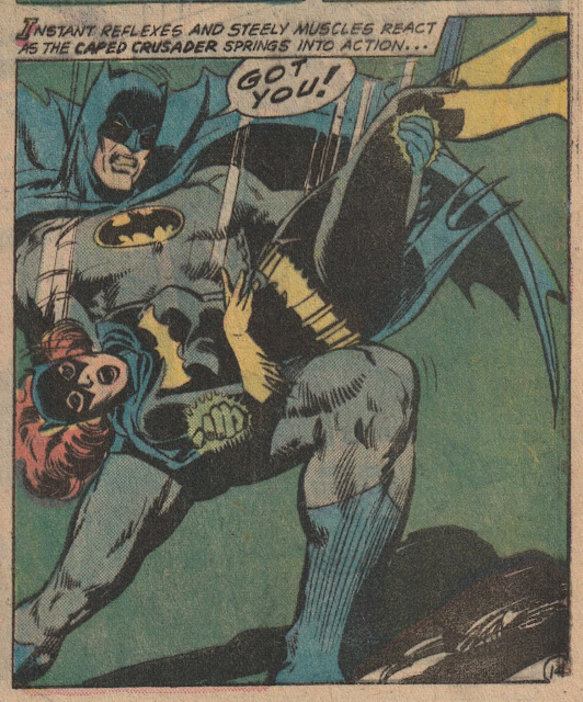
The female characters seem to get a rough go of it here...


(SUPER-TEAM FAMILY #3 - Cover Dated Feb/Mar 1976 - on Newsstands November 25th, 1975 - art by Neal Adams)

But Superman gets the most crushing blow of all. Is it me, or does Batman just always seem to take such great delight when he finds a way to one up old Supes?


(SUPER-TEAM FAMILY #3 - Cover Dated Feb/Mar 1976 - on Newsstands November 25th, 1975 - art by Neal Adams)

Cary Bates was probably one of the more 'hip' guys at DC Comics during this period - which isn't saying much. Compared to Ted Knight, Mary Tyler Moore seemed like a swingin' chick. 
Nevertheless, Bates could provide some modern humor into things...


(SUPER-TEAM FAMILY #3 - Cover Dated Feb/Mar 1976 - on Newsstands November 25th, 1975 - art by Neal Adams)

Overall, a pretty decent issue, with some good art. See! I should've just had fun and read some more DC's when I was a kid!








Monday, September 17, 2018


METAL MEN #9 - The FIRST Quirky Team?

I'll be quite honest. I'm really not all that familiar with the Metal Men. 
But the research has been fun!


(METAL MEN #9 - Cover Dated Aug/Sept 1964 - on Newsstands June 25, 1964 - cover art by Ross Andru)


Many might think the Metal Men were some kind of rip off of the X-Men or the Marvel ‘team’ concept in general, as they’re a quirky group of misfits with a behind the scenes mentor (ala Professor X) - but the truth is, the Metal Men pre-dates the X-Men by a year and a half!
(Not to get off specifics too much here, but it’s actually the Doom Patrol, who it is rumored to have been put together, based upon inside information on Marvel’s upcoming X-Men series. It debuted on newsstands April 18, 1963, while the X-Men showed up almost three months later on July 2nd, 1963. So who copied who?)


First appearing in Showcase #37 (on newsstands January 30th, 1962), you have to figure, at the time when letters pages printed letters from 3-4 months earlier, that the first appearance was written sometime in September 1961. That means that realistically the concept predates all but the first issue of the Fantastic Four. (FF#2 hit newsstands on September 28, 1961). 
So are the Metal Men the first quirky, off-beat team?


(METAL MEN #9 - on Newsstands June 25, 1964 - art by Ross Andru)


Created by writer Robert Kanigher and artist Ross Andru, the Metal Men were a successful 2nd tier series for DC Comics that saw them peak in the mid 60's (#12 in 1966) but falter later in the decade and eventually get canceled and mostly disappear for two decades.

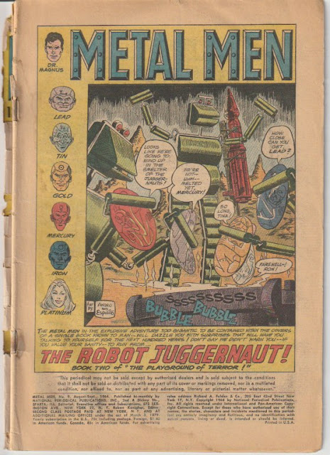
Here in issue #9, the second part of the storyline 'The Playground of Terror', called 'The Robot Juggernaut!', Kanigher and Andru have the team bickering and falling over backward to get their act together while taking on a giant robot. 
This is the type of behavior that history tries to tell us that only Marvel did, but obviously, that isn't true.


(METAL MEN #9 - on Newsstands June 25, 1964 - art by Ross Andru)

So why doesn't it work with Metal Men for me?

When the Russians beat the United States into space in the 1957, our government looked around and saw a nation of rural, uneducated workers. They set about to push education with an emphasis on math, science, reading, etc. By the mid 60's, what you had was a higher educated American than 10 years earlier, and as such, their need for reading that matched their skill level had gone up. 

Not that Metal men is dumb... it's NOT. Robert Kanigher's scripts usually seemed to include information about actual metals and science, on top of having a sense of humor about it that certainly made it a bit more 'hip' than Superman Comics.


(METAL MEN #9 - on Newsstands June 25, 1964 - art by Ross Andru)

And if I had been 13 years old in 1966 (I was 3), I probably would've thought this was awesome. In hindsight though, it reminds me of a lot of DC Comics from this period (vs it's Marvel competition) in that it seems to be geared toward a younger reader.

This would eventually catch up to DC by 1970 as Marvel's continued stories, human characters, social commentary (observed mostly as oppossed to preached) and rabid, older fan base would eclipse them as the #1 publisher of comics.


(METAL MEN #9 - on Newsstands June 25, 1964 - art by Ross Andru)

I mean, even though these characters joke around and seem to have human characteristics... the truth is, they're robots. It just doesn't register with ME, the way Peter Parker/Spider-man did (one of the few comics I would remain reading into my post teen years).

Once again... it's not BAD. It's moderately entertaining. 
Just not the kind of thing that makes me want to track down back issue, get a subscription, and follow for the rest of my life.


(METAL MEN #9 - on Newsstands June 25, 1964 - art by Ross Andru)

And it's weird, but Ross Andru's art here just doesn't 


(METAL MEN #9 - on Newsstands June 25, 1964 - art by Ross Andru)


Sunday, September 2, 2018


STRANGE TALES #174 - There Walks the GOLEM!

One of the earlier comics I ever had was this Strange Tales #174 from the Spring of 1974. 

(STRANGE TALES #174 - Cover Dated June 1974 - on Newsstands March 26, 1974 - cover art by Ernie Chan? John Buscema? Tony DeZuniga?)


What a great cover and what a controversy surrounding who drew it!
I've read Gil Kane, Tony DeZuniga, John Romita, and Ernie Chan for pencils and then Ernie Chan, Tony DeZuniga, and John Romita for inks. Personally, I think it's John Buscema breakdowns finished by either DeZuniga or Chan, but... anyone ever ask one of them?


(STRANGE TALES #174 - Cover Dated June 1974 - on Newsstands March 26, 1974 - art by John Buscema)

Written by Len Wein (Who'd soon be one of Marvel's early 70's revolving Editor-In-Chiefs) and drawn by John Buscema, 'There Walks the Golem' is the story of a archeiologist who is trying to discover the remains of an ancient legend, when he and his family are approached by shady looking desert soldiers needing a place to stay. It doesn't turn out well, and you kind of know where it's headed, but still... it's good little opening to the first part of three Golem stories Marvel would publish  inbetween the Brother Voodoo short run and Jim Starlin's Adam Warlock run.

Note: There was a reprint issue inbetween this and the other two Golem stories, which reprinted both stories from Amazing Adventures #1 (1961). I can't remember ever seeing that issue for some reason. 


(STRANGE TALES #174 - Cover Dated June 1974 - on Newsstands March 26, 1974 - art by John Buscema)

Big John Buscema is, of course in fine form here, even with somewhat bland inks by Jim Mooney. I miss this brand of storytelling. It's fun to read these old comics, because the artists MADE them easy and fun to read. And Big John was one of the best.


(STRANGE TALES #174 - Cover Dated June 1974 - on Newsstands March 26, 1974 - art by John Buscema)

One of the sequences I always loved in this was at the end of the Professor's story of the Golem's past, as the sand slowly swallows him up. The words, the art... it left an impression on me that I still look back on and smile about!


(STRANGE TALES #174 - Cover Dated June 1974 - on Newsstands March 26, 1974)

In the middle of the story (and I never understood why they did it this way), is the editorial stuff and here is Marvel's spin on their price increase. Now 25 cents! Oh, if they only knew...


(STRANGE TALES #174 - Cover Dated June 1974 - on Newsstands March 26, 1974)

Just as interesting is this blurb that follows it... Golem is the first Jewish Superhero! He is? When did it become known that Wesley Dodds was Jewish? He was the Golden Age Sandman - I think that predates the Golem by quite a few years...


(STRANGE TALES #174 - Cover Dated June 1974 - on Newsstands March 26, 1974 - art by John Buscema)

The big reveal in the issue of course is the Golem returning and doleing out his vengeance. There's a twist to it though, which I won't reveal here (45 year spoiler free), but I will show the sequence above as I really dug it as a 11 year old reading this story....

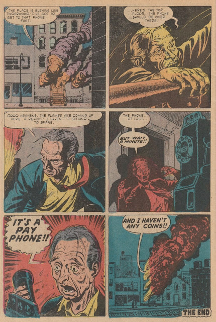
And for your enjoyment, here is the 3 page back-up story, in it's entirety, reprinted from Strage Tales #110 (December 1952), heavily influenced by the style and story of EC Comics of the same period. It's great Russ Heath art that perfectly captures the tone of the Stan Lee's story.

I would have to say, Marvel/Atlas' first 'Horror' comic would've been (though Venus was already starting to get weird, in a cool way, just a month or two earlier) Suspense #3 (May 1950 on newsstands February 2nd, 1950), which really seemed to capture the EC style. EC had begun the changeover to Horror in January cover dated books and seen an instant surge in sales.

Marvel/Atlas, as they did with anything that someone else had success with, quickly began to copy it.

One of these days I'll do an entry on all the ways Stan Lee copied EC Comics over the years. They were successful, until the other publishers put them out of business, so it makes sense that SOMEONE copied what they did right.


(STRANGE TALES #174 - Cover Dated June 1974 - on Newsstands March 26, 1974 - Reprinted from Marvel Tales #110, December 1952, art by Russ Heath)


Superman's Girl Friend LOIS LANE #98 - Romance Comics in Plain Sight
I'm going to warn you ahead of time - I may sound overly critical of Curt Swan's work here in this piece. I get that he was the definitive Superman artist for 2 1/2 decades. No question about that. But personally, I just never understood the huge fan love for his work, other than "I was 13 and these were my favorite comics." That I get. Going back and discovering his work after reading Neal Adams Superman stories? Hmmm...
Now I wasn't a big Superman fan as a kid, and really was more of a Marvel guy in general, but I've started to read some of these old DC books, because... well, because when it comes to cheap readers, there just tends to be a lot more DC than Marvel available. So we'll start with this cover. I've always felt Swan's figures for his covers were better than his interior art, and this is a good example. Superman looks properly proportioned here, and Lois actually looks like she has an attractive figure. 
There's probably a tiny bit more wasted space than needs to be here, and the action is nearly non-existent. It's practically the opposite of a Marvel cover where the characters almost seem to leap off the page. HOWEVER, this IS a romance comic, if not in specific genre (it's considered part of the Superman Family of books), most CERTAINLY in content. So in that respect, it shouldn't have the same, 'jump off the page' action as a normal superhero comic. 
It's not a BAD cover - it's okay. Professional. Does the job.
Scan.jpeg
(Superman's Girl Friend LOIS LANE #98 - Cover Dated January 1970 - on Newsstands November 13, 1969 - cover art by Curt Swan)

Yes. Professional. Does the job.
THAT is Curt Swan. As Gary Groth once wrote: 
"Swan is symptomatic of what the industry requires. They adore Swan at DC because they give Swan a -script and it says 'Superman flies out the window'...and there's Superman flying out the window. The -script says 'Clark Kent walking down the hall' and there's Clark Kent walking down a hall. He's just a technician who does exactly what's required of him."
 Unlike Groth (who's opinions on much of comics I DO respect - sorry fanboys), I'm ok with THAT aspect of Swan's work. He's a MAINSTREAM comic artist on the most MAINSTREAM Family of books. He's NOT Neal Adams. There's still a lot to be said for someone who can do the job exactly as told to do it. DC wasn't producing ART, as much as Groth, and many of us wished they would have. They were producing PRODUCT, and as such, Swan was a sturdy machine, pumping out what was asked on a monstrous monthly basis. He maybe did more work than any artist in comics, other than Kirby.
But unlike Kirby who was constantly soaring with new ideas and ways to express them, and ever-evolving as an artist, Swan was slow and steady and the same, same, same.
Which is part of my issue with him...


Another issue I have are the artists completely overlooked who I felt were far superior to Swan, and right here in this issue, we get to compare them back to back. Irv Novick got his start in the Golden Age (an early MLJ artist!), where his creativity was on display even in the infancy of the profession (you can read about some of it in my Undercover Archie blog). Here at the ripe old age of 53 (he was 4 years older than Curt), we see a splash page that is far superior to the cover. It's almost as if the editor told the both of them, "Draw me a full page of Lois cutting off a lock of Superman's hair, amused that it is robbing him of his powers", and THIS is the contrast in style between the two artists. And DC chose Swan's cover???
In Novick's, Superman looks furious, explosive, yet held back by Roman guards (it's a Samson and Delilah story), while Lois, looks sexually suggestive, in a position of relaxed power. The word ballons, editorial text, and title are all perfectly placed within the room that's left. 
Far superior to the cover.
Scan%2B1.jpeg
(from Superman's Girl Friend LOIS LANE #98 - on Newsstands November 13, 1969 - art by Irv Novick)

And speaking of Superman, which is Swan's 'speciality', let's look at the splash page for HIS story, featuring the Man of Steel. I personally find this layout boring. I can't stand Superman's bland body shape here, a constant annoyance I have in Swan's style. He looks like a husky 25 year old male instaed of a 'Man of Steel'. His entrance is pretty vanilla - stationary camera angle... And Lois? You may as well be drawing a 15 year old boy. I just don't get the excitement for this work. Neal Adams must've given some of these old timers a heart attack when he first came to DC.
Scan%2B6.jpeg
(from Superman's Girl Friend LOIS LANE #98 - on Newsstands November 13, 1969 - art by Curt Swan)

So let's look back at Novick's story and compare a Superman entrance. Superman's entrance is EXCITING, as it should be. It's at an angle that highlights he is descending down. His body language shows action. The expressions of the characters and even their subtle body movements, give us emotion and action within a scene that really ISN'T all that. This is a superb example of an exciting layout within a standard 5 panel page. It keeps the story going without even needing to read it. THIS is how you draw entertaining sequential story art.
Scan%2B11.jpeg
(from Superman's Girl Friend LOIS LANE #98 - on Newsstands November 13, 1969 - art by Irv Novick)

And even when it's a page that isn't full of action, Novick is a master draftsman. Below is a classic Z flow page construction, yet none of his angles are forced - he's using what comes naturally to tell the story in each panel - changing camera angles and perspective when needed. On top of that, he's keeping what could become easily cluttered and messy, quite tidy. 
Let's examine what's going on without reading.
Perry White is examing some pictures and discussing them with Clark and Lois.
Lois is holding the pitcures now and listening intently as White gives instruction.
Clark and Lois talk as they leave White's office.
Lois is looking on in surprise as a man is standing on his head.
A director walks Lois through a room where some perfromiers look to be doing some type of peculiar performance exercises.
Scan%2B10.jpeg
(from Superman's Girl Friend LOIS LANE #98 - on Newsstands November 13, 1969 - art by Irv Novick)

Below, Swan's is a little more heavy handed. The first two panels could very easily just be one and still show Lois' frustration as she runs from her doctor's office. And other than the second panel, it's difficult to tell Lois' emotion
Let's lay these out:
Lois is running down the street from a distance.
Lois is holding her head, upset, as she is nearer to us.
She looks determined, with tears on her cheeks as we see a close up that she is leaving? entering? Hospital parking.
She's driving somewhere, we see the back of her head from a distance.
She's etering a cave with a blank expression.
In the cave she sees a giant snake, man-sized snake, and we see she is shaking from a distance.
Hmm.
Scan%2B8.jpeg
(from Superman's Girl Friend LOIS LANE #98 - on Newsstands November 13, 1969 - art by Curt Swan)

As far as facial expressions, Novick's work in this issue is a great example of how well he told a story with his art. The facial expressions here tell you exactly how the characters are voicing what they're saying and work to help bring the printed page alive.
Scan%2B3.jpeg
(from Superman's Girl Friend LOIS LANE #98 - on Newsstands November 13, 1969 - art by Irv Novick)

Scan%2B4.jpeg
(from Superman's Girl Friend LOIS LANE #98 - on Newsstands November 13, 1969 - art by Irv Novick)

Now here's an example of Swan spicing up his page a bit. Superman is descending down at a camera angle that gives it a bit more action. It starts off in much better in style than some of the other pages in his story, but still is a little more bland than what we see from Novick in the same issue. It's not bad... again, it's functional. 
Scan%2B12.jpeg
(from Superman's Girl Friend LOIS LANE #98 - on Newsstands November 13, 1969 - art by Curt Swan)

In this day and age, you can hear even the average fan talk about and know who Curt Swan is. And he deserves it - he WAS a great, Hall of Fame name in the history of the hobby. But who talks baout Irv Novick? Many comic book fans, even fairly knowledgeable one's just aren't that aware of his work, and yet... he WAS a great artist that worked continuously in the business from 1939 until the 1990's! (He had a short exit of 5 years from 1946-1951 when he worked in advertising).

So it isn't so much my problem, with Curt Swan's work - it was efficient, I guess, iconic to many, and plentiful - the guy put out so much work it's mind boggling. I just think there were better artists out there, working within the same genre and style, who were in his same age group, who were BETTER and more creative and yet get almost no recognition compared to him.
And Irv Novick is a perfect example.


This IS a romance comic. And John Romita worked for 7 years at DC doing romance comics, before he went back to Marvel and helped change Spider-man from just another crime fighter, to a monthly soap opera of broken hearts and jealousy.
And good old Irv Novick was maybe just a bit influenced by Romita in his romance work...
Scan%2B5.jpeg
(from Superman's Girl Friend LOIS LANE #98 - on Newsstands November 13, 1969 - art by Irv Novick)

I'd be remiss if I didn't mention Robert Kanigher's story that opens the comic, "I Betrayed Superman", which is the story that Irv Novick did the art for. It takes a fun poke at the Stanislavski Acting method, calling the instructor here 'Stanislav', and it's pretty funny.
Scan%2B2.jpeg
(from Superman's Girl Friend LOIS LANE #98 - on Newsstands November 13, 1969 - art by Irv Novick)

The facial expressions, the sense of humor... it makes me want to read more Kanigher/Novick work.
Scan%2B7.jpeg
(from Superman's Girl Friend LOIS LANE #98 - on Newsstands November 13, 1969 - art by Irv Novick)

For OE DOLLAR, ya can't beat it. And of course I love reading the ads as well!
Scan%2B13.jpeg
(from Superman's Girl Friend LOIS LANE #98 - on Newsstands November 13, 1969 - art by various. Ok, ok, I recognize Henry Scarpelli on the last issue of Leave it to Binky and in order: Kubert, Cardy, and Adams)