Monday, August 27, 2018

FANTASTIC FOUR #142 - Everything but the Kitchen Sink!

One of the earlier comics I owned within the actual time frame it came out, I would’ve been 10 years old when SOMEONE made this available to me. The cover really stood out...


(FANTASTIC FOUR #142 - Cover Dated January 1974 - on Newsstands October 16th, 1973 - cover art signed by Buckler and Sinnott)

This period of the Fantastic Four is either extremely underrated or extremely overrated, depending how you look at it - but for me, yeah, a lot of it is simply themes that are repeated throughout the history of the book (The Thing gets frustrated and quits, Dr. Doom revealing himself as the bad guy, etc.), BUT it has one redeeming aspect to it all. 

Rich Buckler. 

Rich Buckler achieved a dream of his by getting to take over this book and really, with inks by Joe Sinnott, this is (to me) some of the best work he ever did. (I personally thought Sinnott’s inks worked better for Buckler than Kirby - I like Chic Stone inking Kirby the best). 


(FANTASTIC FOUR #142 - Cover Dated January 1974 - on Newsstands October 16th, 1973 - art by Rich Buckler with inks by Joe Sinnott)

To me, this is the period that MADE the Bronze Age. These were highly stylized artists that either reached their peak during this time (Dave Cockrum on Superboy and the LSH, Jim Starlin on Captain Marvel, Rich Buckler on FF) or would begin to in the next year or two (George Perez on Avengers, John Byrne on X-Men). Note: And of course, I believe Ross Andru did his best work on ASM with his double inking team of Frank Giacoia/Dave Hunt - but I know it’s not everyone else’s fave. 

On top of that you still had Bernie Wrightson just finishing a breathtaking run on Swamp Thing (and Mike Ploog on Marvel Spotlight with Ghost Rider), Barry Windsor-Smith after a run on Conan, going beyond the quality of expectation on the Black and White mags, along with a wave of new great talent like Pablo Marcos, Rudy Nebres and even long-time talent coming into their own like the underrated Jim Aparo. 


(FANTASTIC FOUR #142 - Cover Dated January 1974 - on Newsstands October 16th, 1973 - art by Rich Buckler with inks by Joe Sinnott)


Talk about understanding the Kirby way of doing Marvel Superhero art... here Buckler makes Reed Richards dynamic in every pose - even though his emotion is one of grief - and yet he still is able to convey it and even cover his face (shame). Great stuff from what you’d expect in the World’s Greatest Comic Magazine!


(FANTASTIC FOUR #142 - Cover Dated January 1974 - on Newsstands October 16th, 1973 - art by Rich Buckler with inks by Joe Sinnott)

The Thing at one time was one of the stars of the Marvel Universe, appearing monthly in the FF, the FF reprints in Marvel's Greatest Comics, and with a guest star each month in Marvel Two-In-One. Then afterward in his own monthly series! One of the great, unique characters of the Marvel Universe!

Here Buckler lays out a perfect blend of action and dialogue, changing camera angles perfectly to tell the story. Man, I can see why I was so impressed with this as kid, without even knowing why! (Notice the written ad blurb for Crazy Magazine at the bottom left corner - remember these?) 
Yep, the perfect blend of action and dialogue.

Speaking of dialogue, Gerry Conway (only 22 years old when he wrote this - having been at Marvel already for 4 years!), had a busy month for comics released with a January 1974 cover date. The 20 page Incredible Hulk #171 that would also end up a Record and Comic Set, the 19 page Amazing Spider-man #128 Vulture story, the 11 page Dracula Lives #4 story,  the 19 page Sgt. Fury #117 story,  the 19 page Thor #219 story, a 5 page story for DC's Witching Hour #38, PLUS this 19 page yarn.
That's 112 written pages of story and dialogue - he probably had a bad case of writer's cramp!


(FANTASTIC FOUR #142 - Cover Dated January 1974 - on Newsstands October 16th, 1973 - advertising cover art by Gil Kane)


As a kid, I wasn’t the biggest Gil Kane fan. His angular, jagged edges in very harsh contrast to Romita’s smooth style (I know, I know, but Ross Andru, right?).
Here though, inked heavily by Frank Giacoia, I dug this almost 3-D looking cover in this ad, even back then. 

Frank Giacoia was maybe one of the underrated inkers in the business, working from the Golden Age into the early 80's. 


(FANTASTIC FOUR #142 - Cover Dated January 1974 - on Newsstands October 16th, 1973 - art by Rich Buckler with inks by Joe Sinnott)

And of course the big reveal at the end. It became more and more of a tough way to handle a Dr. Doom story as time went on... so everything went into the build-up. Great villain, but... what to do with him...










Superman's Girlfriend LOIS LANE #35 - Scheming Up and Teaming Up!

Man, it’s amazing to me what comics I can find, beat up, in $1 bins! Another classic Superman/DC artist that I prefer to Curt Swan, the oft-forgotten Kurt Schaffenberger, here with an early 60’s ‘modern-ish’ theme. I really like the way he uses shadows and shading to show depth and perception.


(Superman's Girl-Friend LOIS LANE #35 - Cover Dated August 1962 - on Newsstands June 26th, 1962 - cover art by Kurt Schaffenberger)

Schaffenberger doesn’t get the recognition of a Curt Swan, but just looking at an opening splash page like this and you can see he had a clear vision and a sure line. You can tell what's going on just by their body language. THIS is how you convey information through art!


(Superman's Girl-Friend LOIS LANE #35 - Cover Dated August 1962 - on Newsstands June 26th, 1962 - art by Kurt Schaffenberger)


Women in Romance Comics (and let us make no mistake, Lois Lane was a Romance Comic first and foremost) are always scheming and competing. Lois doesn’t realize it, but that behavior to get ahead with a story is going to follow into her love life as well!


(Superman's Girl-Friend LOIS LANE #35 - Cover Dated August 1962 - on Newsstands June 26th, 1962 - art by Kurt Schaffenberger)


 Scheming, competing and sometimes outright nuts! Lois will destroy the computer of the future (someone else’s property) to keep her rival from winning Superman!
Aw, that’s sweet! Psychotic, but sweet!

I love this very simple and yet informative panel. Even with minimal space, he gives the characters body language and facial expressions that are telling. 


(Superman's Girl-Friend LOIS LANE #35 - Cover Dated August 1962 - on Newsstands June 26th, 1962 - art by Kurt Schaffenberger)

I want both of these! Remember a time when it didn’t seem like a rip off that they were putting out an EXTRA comic for your favorite title, called an Annual?


(Superman's Girl-Friend LOIS LANE #35 - Cover Dated August 1962 - on Newsstands June 26th, 1962 - art by Kurt Schaffenberger, various on the Batman Annual)


I can’t help but make these comparisons right here in the same comic - Swan’s work looks very bland to me compared to Schaffenberger. Both these characters appear stiff and unemotional as they look at a photo of Superman saving Lois. 

Leo Dorfman's story (previous) with Schaffenberger is fun, even if Lois goes a little goofy with jealous and over competitiveness. It's difficult to balance that in DC's line of books - keep it light - with a bit of 'oh no, what will happen next' - without drifting too far either way - serious drama or absurd kiddie stories.


(Superman's Girl-Friend LOIS LANE #35 - Cover Dated August 1962 - on Newsstands June 26th, 1962 - art by Curt Swan)


Jerry Siegel’s story here is a bit hokey - Lois loses her memory, Superman reveals his secret identity to eventually shock her out of it, but she conveniently forgets. Maybe I'm being a bit hard on it, but with Swan's bland art, it just doesn't entertain me the way the previous story did.

And below: Superman as a player... even this humorous exchange is rendered rather blandly. 


(Superman's Girl-Friend LOIS LANE #35 - Cover Dated August 1962 - on Newsstands June 26th, 1962 - art by Curt Swan)

The final story we get Dorfman and Schaffenberger back for a Lois Lane story featuring Supergirl. I'm all about that! Schaffenberger's inks are even more to my liking in this story, as he seems to have gotten a brush he wants to work with! 

His layouts tell the story, as Supergirl remains rigid to show her strength here (an unmovable object) while action happens all around her. She gets her civilian clothes shot off, so it's a good thing she remembered to wear her costume!


(Superman's Girl-Friend LOIS LANE #35 - Cover Dated August 1962 - on Newsstands June 26th, 1962 - art by Kurt Schaffenberger)


One last interesting note about this issue - in the same month (three weeks earlier) - THESE three comics came out from Marvel! That's a good month!


a

Sunday, August 26, 2018

HAWKMAN #25 - My Baby has a Temper!

Here's another series I'm pretty clueless to, but this cover lured me in and, boy am I glad it did. It sort of has a 'Coop' (Devil Girl artist Chris Cooper) look to Dick Dillin's art (even though Coop was born the year this came out!). Anyway, I dig it a great deal - the sexy green 'Death Goddess' - the flames  - Hawkman getting his butt kicked - the purple background...

(HAWKMAN #25 cover-dated Apr/May 1968, on newsstands February 15th, 1968 with cover art by Dick Dillin)


One of the things I always subconsciously noticed about Hawkman, despite almost never reading any of this series (or any of his series ever), is that they always seemed to make his wife Shayera Hol (I had to look that up), or Hawkgirl, look... more sexy than other DC women. 

This issue REALLY kind of highlights that, as she's possessed by the spirit of Medusa and goes berserk, wanting to destroy the world.


(HAWKMAN #25 cover-dated Apr/May 1968, on newsstands February 15th, 1968 with art by Dick Dillin)

Dick Dillin, was a Quality artist (see what I did there?) who drew Blackhawk throughout the 50's and continued to draw the character over at DC as they bought the publisher. Finally after 18 YEARS on the book, he did a few issues to finish off the Hawkman series, before he'd make a name for himself on Justice League of America for the next 12 years.

Here, his art is... well I've already compared it to a semi-pornographic pop culture 'hot rod' artist, but... it has almost a Charles-Burns-does-a-Mainstream-Comic-Parody look to it, which means of course, I LOVE it. Chuck Cuidera's heavy brush inks, just add to it so well. 


(HAWKMAN #25 cover-dated Apr/May 1968, on newsstands February 15th, 1968 with art by Dick Dillin)

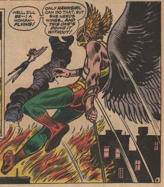
Was Hawkgirl the only one who flies as a woman at DC Comics in 1968? What about Supergirl?
It used to drive me nuts when superheroes would make these kinds of statements, knowing full well it isn't true.

Richard Hughes wrote the story... he spent a long career at ACG Comics and then had a short stint at DC to finish his career. 

(HAWKMAN #25 cover-dated Apr/May 1968, on newsstands February 15th, 1968 with art by Dick Dillin)

Come on. Look at this page. A sexy woman, a growling TIGER, and Hawkman flying in to save the day while holding a walkie-talkie! Or a radio. It sounds cooler saying it's a Walkie-Talkie.
But I love this page. The story is ok... I mean it's a 1960's comic book. But the art is cool and really, that's what I'm looking for.

If Dick Dillin had a habit of drawing his females this sexy, I might have to take a look at his JLA run... I'm already won over by his art altogether.


(HAWKMAN #25 cover-dated Apr/May 1968, on newsstands February 15th, 1968 with art by Dick Dillin)

It's not a full 20-page story, so they have a backup reprint story from Flash #12 (1940) drawn by Sheldon Moldoff and written by Hawkman co-creator Gardner Fox (with Dennis Neville). He co-created the story, he didn't co-write this story.

Some pretty cool detailed art by Moldoff for 1940...


(HAWKMAN #25 cover-dated Apr/May 1968, on newsstands February 15th, 1968 with art by Sheldon Moldoff. This story is a reprint from Flash Comics #12, cover-dated December 1940, on newsstands October 15th, 1940)


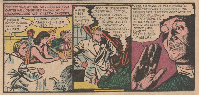
Reading a story from the Golden Age almost always shows us the difference in eras - society AND comics - and here Carter Hall (Shhh, he's really Hawkman), says, "There's Tommy Rogers. Drunk as a Lord." Good stuff.


(HAWKMAN #25 cover-dated Apr/May 1968, on newsstands February 15th, 1968 with art by Sheldon Moldoff. This story is a reprint from Flash Comics #12, cover-dated December 1940, on newsstands October 15th, 1940)

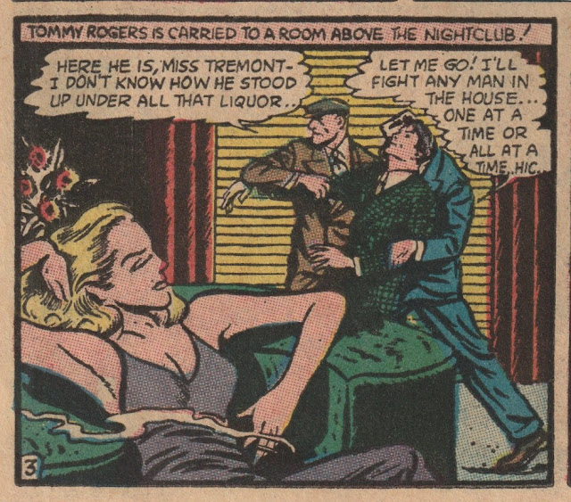
Yeah, it's interesting to compare the evolution of the art, story, mannerisms, etc.


(HAWKMAN #25 cover-dated Apr/May 1968, on newsstands February 15th, 1968 with art by Sheldon Moldoff. This story is a reprint from Flash Comics #12, cover-dated December 1940, on newsstands October 15th, 1940)


Friday, August 24, 2018

MARVEL TEAM-UP #12 - Wanna Play on the Bridge?

Marvel Team-Up was the FIRST regular spin-off series for Spider-man (Spectacular Spider-man Magazine preceded it for two issues) and featured Spidey in all but 10 of its 150 issues and 1 of its 7 Annuals.

Somewhere out there, someone has all 150 issues collected, but amazingly enough all SEVEN Annuals as well. I can picture the first one in my head (Spidey and the X-Men) but for the life of me can't remember the other 6.

On the cover here we have Gil Kane heavily embellished (inked) by John Romita, so that... well so that it looks more like a Romita drawing than a Gil Kane drawing, which is what I prefer. I appreciate Kane's work in my older age, but Romita is, to ME, the greatest, most underrated artist of his era.

And it gives us, really, an amazing type of cover, that both artists are known for, and here working together they've created an almost 3-D like look at these two characters. 

(MARVEL TEAM-UP #12 - Cover Dated August 1973 - on Newsstands May 29th, 1973 - cover art by Gil Kane with inks by John Romita)

Don Perlin isn't someone who I was much of a fan of throughout my young comic book reading days, or even later on, but... looking at some of his work now, especially when he has a strong inker, he has some really quality work out there!

HERE, he's essentially Ross Andru's inker and maybe finisher to some degree, but I can tell these truly are Andru's layouts (I grew up on his ASM), and Perlin's inks/finishes give Andru's work a really smooth appeal. I like this a lot.


(MARVEL TEAM-UP #12 - Cover Dated August 1973 - on Newsstands May 29th, 1973 - art by Ross Andru and Don Perlin)


Now, strangely enough, despite taking place (in real-time) two months after Gwen's death and a month after the Green Goblin/Norman Osborn's death (both remembered in thought here by Peter/Spidey), he isn't freaked out by the Werewolf, at the start of the story, falling to his 'demise' off the side of the Golden Gate Bridge!

(For those that don't know, the love of Peter's life, long-time girlfriend Gwen Stacy was knocked off the George Washington Bridge in New York by the Green Goblin. Spidey used his web to catch her, but the jolt snapped her neck, killing her instantly.)

Hmm... maybe that's why he doesn't shoot his web and try and save the Werewolf here?


(MARVEL TEAM-UP #12 - Cover Dated August 1973 - on Newsstands May 29th, 1973 - art by Ross Andru and Don Perlin)


Ok, so I'll chalk it up to 'its not the same bridge', and he's in a different city (San Francisco on assignment).

As you may or may not know, I'm easily amused by comic book characters (or actors/actresses) getting boinked on the head, and here, later in the story, Wolvie (who survived the fall), lunges at Spidey, Spidey leaps out of the way, and Wolvie knocks himself out by crashing headfirst into the side of some poor guys parked sedan. They've should've put that scene in one of the movies!


(MARVEL TEAM-UP #12 - Cover Dated August 1973 - on Newsstands May 29th, 1973 - art by Ross Andru and Don Perlin)

MTU has some lame villains though, and this one, Moondork, uh, I mean Moondark is a perfect example. As goofy as he is, he'd appear at least 4 other times after this though...

Did you know that whenever Spidey WASN'T one of the Team-Up heroes in the book (18, 23, 26, 29, 32, 35, 97, 104, 105, and Annual 3), it coincided with the release of one of his Giant Size Issues?

Well, it's not true. I fact-checked it and SOME of those issues did:
MTU #23 (Human Torch/Iceman) vs Giant-Sized Spider-Man #1
MTU #26 (Human Torch/Thor) vs Giant-Sized Spider-Man #2
MTU #29 (Human Torch/Iron Man) vs Giant-Sized Spider-Man #3
MTU #32 (Human Torch/Son of Satan) vs Giant-Sized Spider-Man #4 and
MTU #35 (Human Torch/Dr. Strange) vs Giant-Sized Spider-Man #5
Ah well. When MTU ended (#150) it was replaced by Web of Spider-man.


(MARVEL TEAM-UP #12 - Cover Dated August 1973 - on Newsstands May 29th, 1973 - art by Ross Andru and Don Perlin)


Why I didn't send away for this as a 12-year-old, I don't know. I sent away for the Legion of Super-Heroes issue of Amazing World of DC Comics and I was MUCH more of a Marvel guy than a DC guy. 

It looks pretty cool...

(MARVEL TEAM-UP #12 - Cover Dated August 1973 - on Newsstands May 29th, 1973)


They must've been really impressed with this cover or lacking story to give it a full-page spread. I mean... it's for Doc Savage... issue #3.

You want real Doc Savage from non-Golden Age Pulp, I'd go with the Curtis Magazine Series.

It IS a sweet Gil Kane cover here though...


(MARVEL TEAM-UP #12 - Cover Dated August 1973 - on Newsstands May 29th, 1973 - art by Ross Andru and Don Perlin)

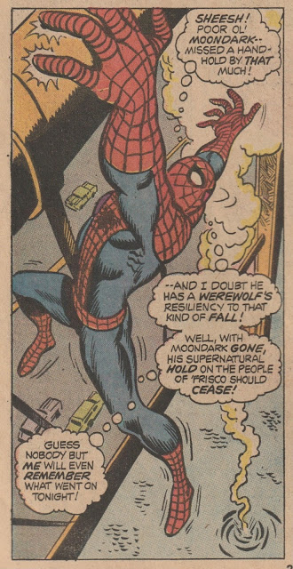
Now at the end of the story, Spidey finishes off Moondark by letting him fall to his death from a BRIDGE! For the 2nd time this happens in THIS comic, just two months after Spidey sees Gwen fall to her death from a BRIDGE.

His attitude about it is pretty breezy, and... yeah, there was no general knowledge of PTSD at that time, but... sheesh. Talk about a weird lack of editorial!

(MARVEL TEAM-UP #12 - Cover Dated August 1973 - on Newsstands May 29th, 1973 - art by Ross Andru and Don Perlin)


Thursday, August 23, 2018


TIPPY TEEN #1 - This Looks Familar!

Wally Wood had a long and storied career in comics, and there's plenty to go into, but of note today was his and Publisher Harry Shorten's Tower Comics. Shorten had worked as a writer and Editor at MLJ (Archie Comics) in it's early days and Wood had worked for nearly everyone.

Tower Comics is primarily remembered for it's Thunder Agents by Wally Wood, but the LONGEST RUNNING comic they published was Tippy Teen, an obvious Archie Comics influenced Teen Humor book.


(TIPPY TEEN #1 cover-dated November 1965, on newsstands September 1st, 1965, cover art by Samm Schwartz)

Shorten brought in Samm Schwartz from Archie Comics to Edit and oversee the book, so naturally, Schwartz got work for Archie artists Harry Lucey, Dan DeCarlo, and Bob White.

Harry Lucey did the first story and... that looks a LOT like Archie, Betty and Veronica (with hair colors the same, but styles switched) and blonde-haired guy (Animal) as a cross between Moose and Jughead. From what I've read, these characters were designed (homaged) by Schwartz.


(TIPPY TEEN #1 cover-dated November 1965, on newsstands September 1st, 1965, art by Harry Lucey)

And the innuendo was there from the beginning...

(TIPPY TEEN #1 cover-dated November 1965, on newsstands September 1st, 1965, art by Harry Lucey)

As well as Harry Lucey's famous female poses. If the stories were true, and Lucey would turn his art in with the female characters not wearing any clothes, uh... the inkers certainly got an eyefull!


(TIPPY TEEN #1 cover-dated November 1965, on newsstands September 1st, 1965, art by Harry Lucey)


The second story was done by Dan DeCarlo. 1965 was DeCarlo coming into his prime. And this... this looks like a variation of Betty and Veronica with all of the small detailed touches of 1965 home life. 

(TIPPY TEEN #1 cover-dated November 1965, on newsstands September 1st, 1965, art by Dan DeCarlo)

There are moments when you just do a double-take and think... dd they take this STRAIGHT out of an Archie comic? Hey... I love DeCarlo's work (and Harry Lucey and Samm Schwartz), so I love this issue. So it's ok!

(TIPPY TEEN #1 cover-dated November 1965, on newsstands September 1st, 1965, art by Dan DeCarlo)


I like how they brought back some sexual innuendo too. Not much, but you didn't see anything like THIS in Archie anymore. The art was by longtime journeyman Bill Williams and fits in pretty well. GCD seems to think Samm Schwartz inked him here, but it can be hard to say.


(TIPPY TEEN #1 cover-dated November 1965, on newsstands September 1st, 1965, art by Bill Williams)


The problem with doing an Archie rip-off... eh homage, is that they've already done almost every storyline you can think of already and ripped THEMSELVES off repeating stuff numerous times. Here, Harry Lucey rips George Frese off with story he drew in Ginger #1 from 1952. Who'd ever remember, right?


(TIPPY TEEN #1 cover-dated November 1965, on newsstands September 1st, 1965, art by Harry Lucey)


Some of the panels are straight up lifts, and even though Lucey does spice it up a bit and make minor changes - when you read them back to back, it's very clear... still, back in 1965 very few people would've even noticed.

(TIPPY TEEN #1 cover-dated November 1965, on newsstands September 1st, 1965, art by Harry Lucey)

Lots of Pin-ups to take up space...

(TIPPY TEEN #1 cover-dated November 1965, on newsstands September 1st, 1965, art by ....)


(TIPPY TEEN #1 cover-dated November 1965, on newsstands September 1st, 1965, art by ....)


(TIPPY TEEN #1 cover-dated November 1965, on newsstands September 1st, 1965, art by ....)


(TIPPY TEEN #1 cover-dated November 1965, on newsstands September 1st, 1965, art by Samm Schwartz)

And... the Beatles-esqe storyline (which I always loved) in which Tippy actually gets to play with the band. 

This series isn't loved by many, but I'm one who still appreciates it... especially this first issue with Lucey and DeCarlo. 

(TIPPY TEEN #1 cover-dated November 1965, on newsstands September 1st, 1965, art by Bill Williams)